Corporate Design of a family brand for the distribution of food products. The company is fair trade certified and focuses on brands with organic products.
Conception and design of a corporate design, that transports the subject of food in a way in which content and style of all product brands find their place.
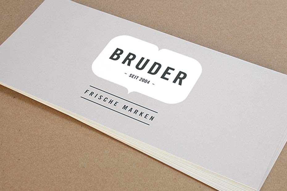
The symbol of a bracket (parent and merging) and the symbol of a heart (personal, with love for the products) are combined to the brand logo. Natural appearance is achieved by using recycled paper and 'letterpress' as printing method for the business cards.
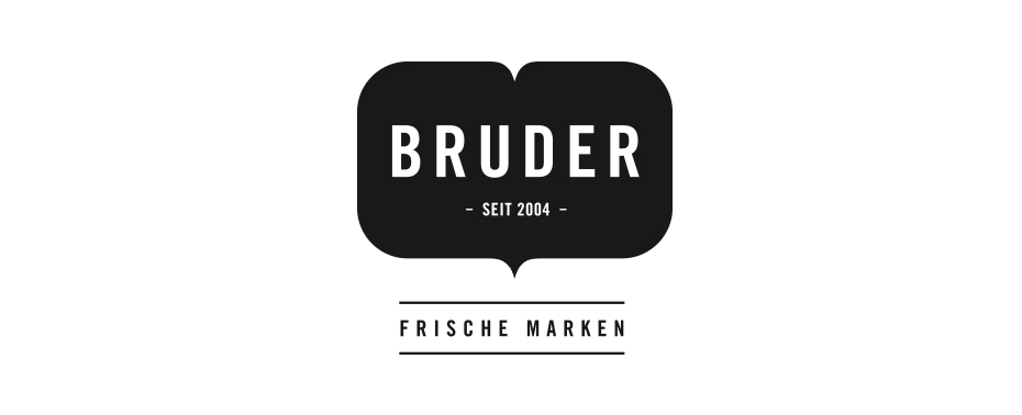
BRUDER Corporate Design | Logo

BRUDER Corporate Design | Explanation
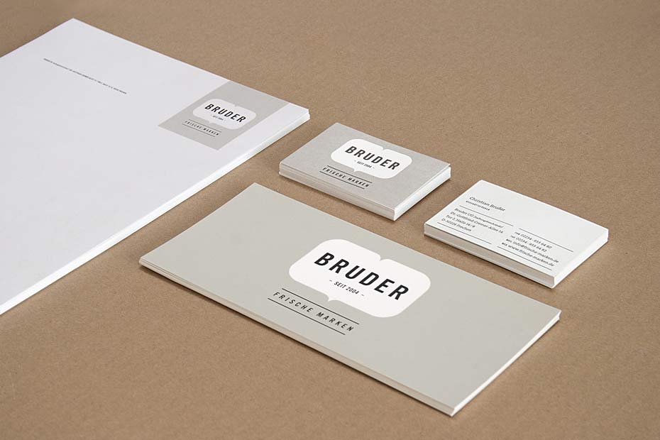
BRUDER Corporate Design | Business paper overview
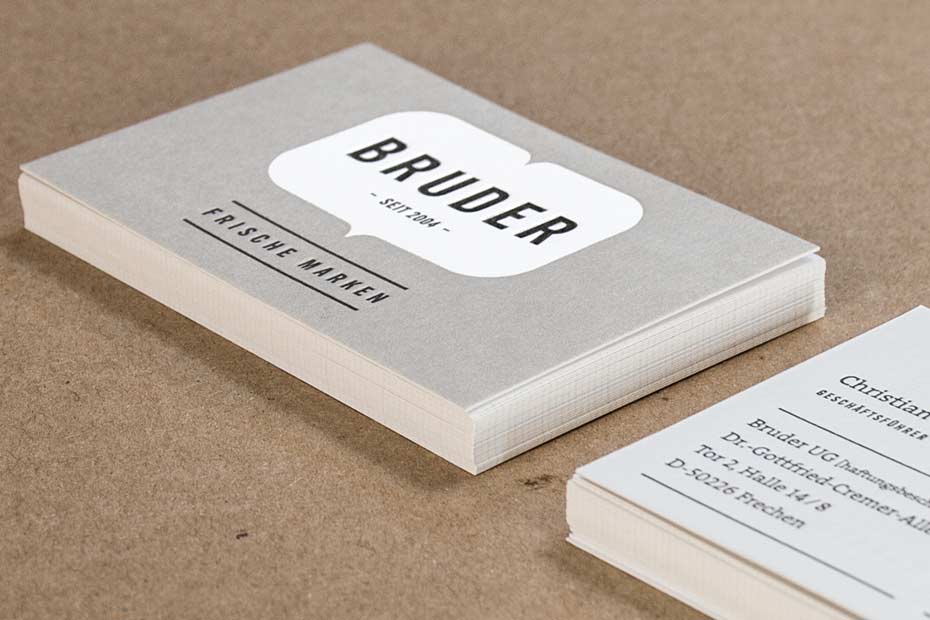
BRUDER Corporate Design | Business card [Print method letterpress]
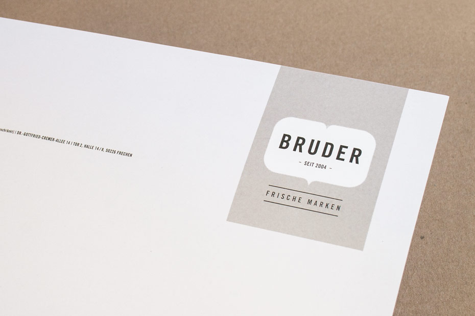
BRUDER Corporate Design | Letterhead
BRUDER Corporate Design | Memo
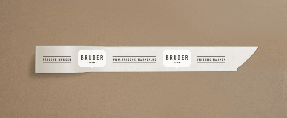
BRUDER Corporate Design | Branded packaging tape
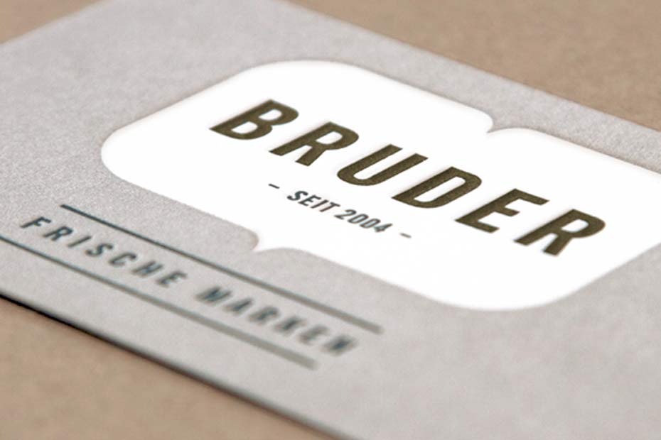
BRUDER Corporate Design | Business card detail embossment [Print method letterpress]